PetPrep - Aiding the Pet Adoption Process
Time: 10 weeks
Tools: Figma
Type: Mobile App Design
Role: UI/UX Designer
Team: 3 (Irene, email for names)
Overview
This project was part of a User Experience course. There were problem areas we could choose to base our project on. The problem area that our team decided to focus on was the issue of adoption, pet care, and the knowledge gap that new time pet owners tend to have when adopting.
PetPrep aims to help prepare new time pet owners in learning the information needed before, during, and after the adoption process and help continuously guide them throughout their parenting.
Project Introduction
Application for Supporting A Responsible Adoption Process for Stray and Abandoned Pets in Urban Areas.
Stray and abandoned animals are a big problem in cities as they create health and safety hazards. Animal shelters struggle to get people to adopt pets because some people either don't trust shelter animals, or don't know how to care for them. Current applications for adoption does not adequately address the need for more information prior, during, and after the adoption process. The potential stakeholders that the problem file mentioned were potential adopters and civic-led shelters. The main design requirements we got from this file was to
(1) have clear information on the adoption process,
(2) have educational resources, and
(3) support after adoption.
Empowering Civic-Led Animal Shelters
PetPrep not only aids first-time pet owners but also serves as a powerful tool for civic-led animal shelters. By offering a unified platform, shelters can:
Increase Visibility: Showcase available pets to a wider audience, reaching potential adopters directly.
Streamline Adoption Process: Provide consistent, accessible information about each pet and the adoption procedure, reducing the workload for shelter staff.
Enhance Community Trust: Build trust through educational resources that reassure adopters about the care and health of shelter animals.
PetPrep
Our design aims to reduce the uncertainties that come with being a first-time pet owner and potential adopter and provide the necessary resources to motivate responsible pet ownership.
The users would be potential and new pet adopters. Their ages would range from 18+ (as this is the minimum age to adopt a pet in the United States).
Why Focus on First-Time Pet Owners?
Address a Common Need:
First-time pet owners often face a multitude of uncertainties and challenges as they navigate their new role. They may lack experience in pet care, nutrition, training, and/or understanding animal behavior. Our app directly targets this gap by providing tailored guidance and resources to ease their transition into responsible pet ownership.
Encouraging Responsible Ownership:
Educating and empowering new pet owners from the start fosters a culture of responsibility and care. By instilling best practices and emphasizing the importance of commitment and understanding in pet ownership, our app contributes to creating a community of responsible pet guardians who prioritize the well-being of their furry companions.
Initial Design (Sketches)
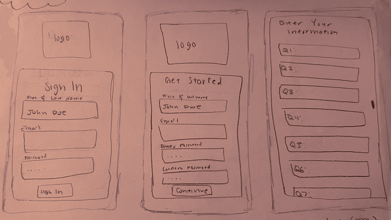
Here are some of our initial designs that were drawn on paper. This helped give us a feel for the designs and would allow for quick iteration. The features were decided based on the importance and described below. I was in charge of “housecheck’”
Intro Survey
This feature requires potential owners to fill out a form about themselves that determines whether they are ready to adopt and if they are currently in a good standing in all aspects of their life. The goal of this page is to understand the needs and wants of the individual while also educating the individual on adoption requirements.
PlayDate
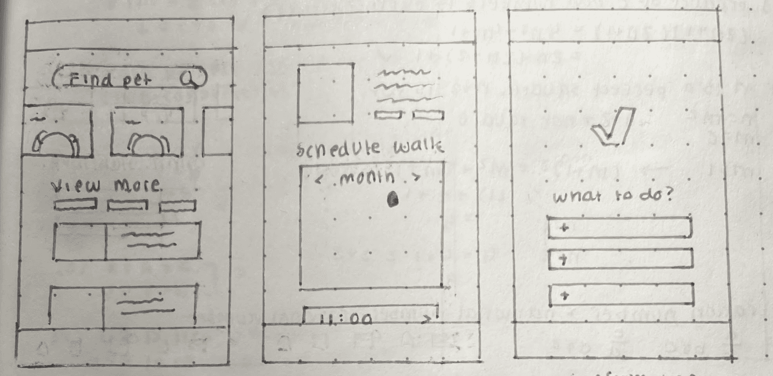
This feature enables users to interact and bond with their potential pet through scheduling a “playdate.” The first page of this feature (depicted below in the sketches section) allows users to view all pets in the shelter in need of adoption. Each pet is depicted in this page, with a description of their likes and dislikes, as well as favorite activities. Once the user selects a pet, they can schedule a playdate. Users can choose a day that works best with their schedule, and further select a time they can meet their potential pet. Once the date and time are both selected, users will receive a confirmation of their “playdate.” Below this confirmation is a faq for first time pet owners.
Resources
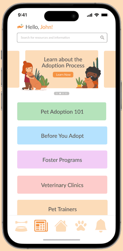
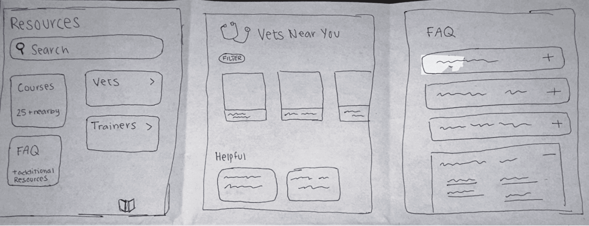
This feature provides pet owners and potential pet owners with all types of information, presenting users with vet options, trainers, and other courses in their area. The page has space for any sort of question owners might have about taking care of an animal. There is space for financial support, training support, etc.
Housecheck
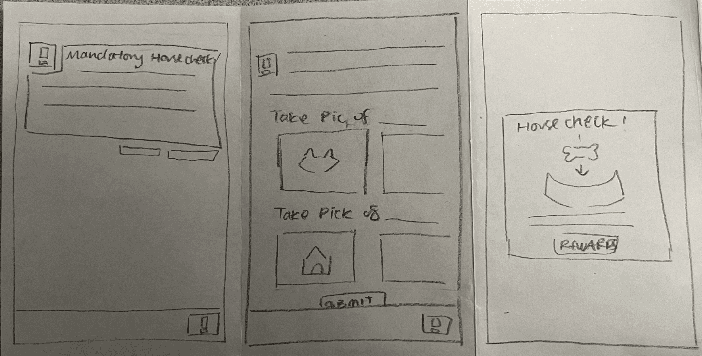
This feature requires new pet owners to provide proof to shelters that they are properly taking care of their new adopted pet. The house check requires pet owners to take a photo of their pet, the living condition, and possibly any other information that a shelter needs to deem the owner responsible. The page ensures pet owner's responsibilities as this is both a required step in the adoption process and provides an incentive to motivate pet owners to continue to take good care. Submissions are reviewed and when reviewed they’re able to receive coupons or other types of rewards related to pet care (e.g pet food, pet training).
Storyboard
We created storyboards (an example shown below) to visualize the concept of PetPrep. These storyboards were then shown to our peers during design critiques.
The story that we wanted to convey was that PetPrep is a solution for anyone that was looking to adopt a pet and is unsure how to start or doesn’t know where to begin. PetPrep is designed to help with getting them the information they need to start adopting and help them along their pet care journey.
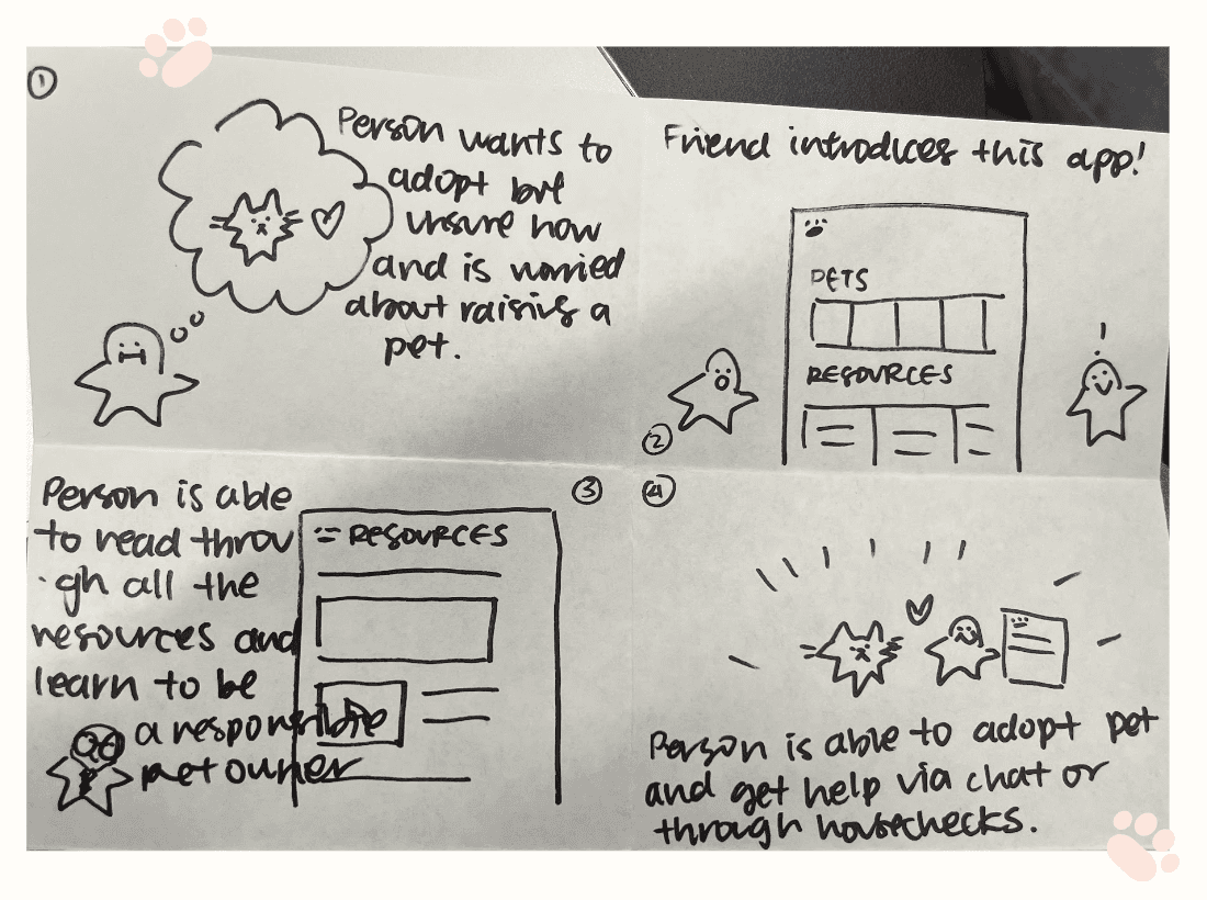
(From top left to right, the storyboard reads: (1) Person wants to adopt but unsure how and is worried about raising a pet. (2) Friend introduced this app! (3) Person is able to read through all the resources and learn to be a responsible pet owner. (4) Person is able to adopt pet and get help via chat or through housechecks)
Paper Prototype
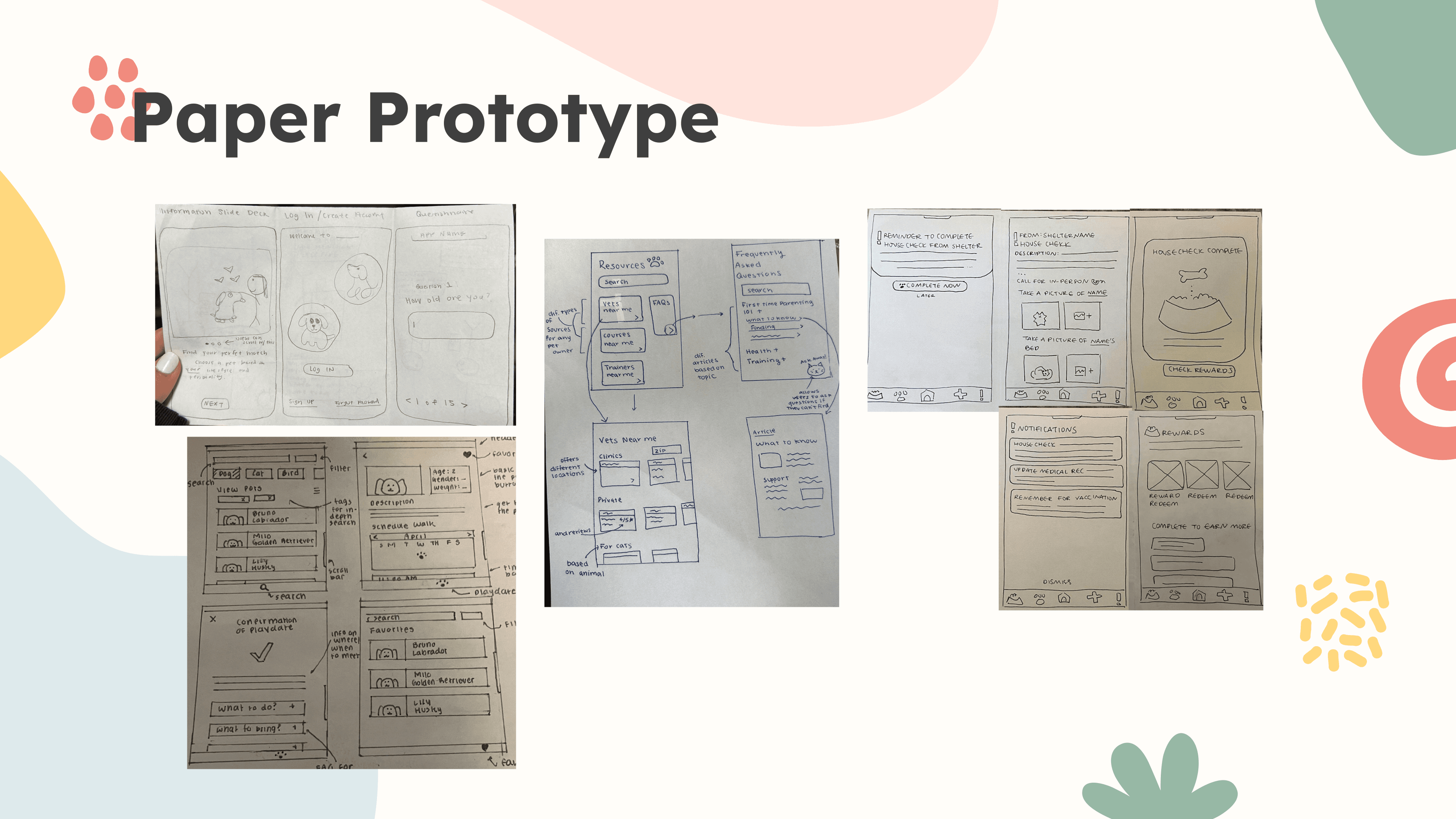
The next step we did was creating paper prototypes for our key screens that we had decided based on the project statement. These paper prototypes were iterated from our initial designs and the comments we had received from our peers during the design critiques and storyboarding process.
Some of the key screens are (show below):
top left is the introduction/sign up: users can fill out a form of personal information to express what their current knowledge is like, what they’re looking for, and also act as an initial screening for adoption sites
bottom left is pet playdate set up: users can decide to meet with the pets before adopting
middle is resources: users can browse a series of articles, videos, and chat with a professional
right is housecheck and rewards: users can complete tasks (e.g. learning about proper pet care) to receive rewards and the “housecheck” is for checking in on new parents and their fur babies
Usability Testing Process
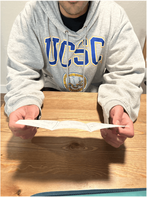
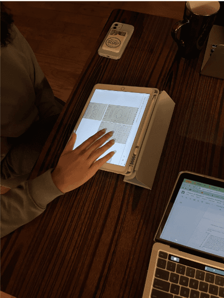
This next section, “Usability Tests”, allowed us to interview potential users and understand whether the designs were intuitive and we had them reflect on their experience on being a pet owner and how this would help them back then.
Our usability test consisted of reading interviewees a scenario (shown below) to imagine, tasks for them to complete and speak aloud, and then a couple general exploratory questions about their personal experience and experience with the designs.
Scenario
You are a first-time pet owner who is thinking about adopting a pet. However, you are overwhelmed by the information overload from your google searches about pet adoption. And that's when you come across PetPrep.
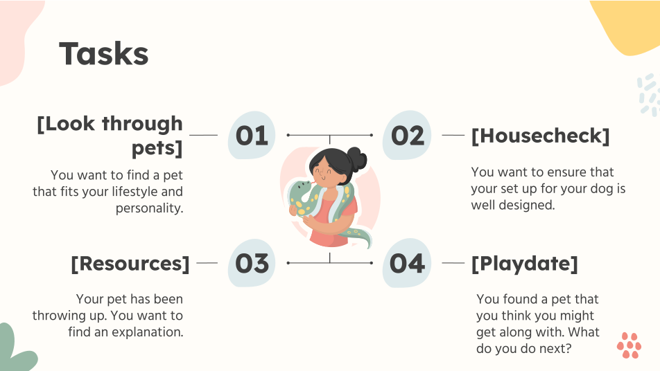
Below are some of the tasks that we asked. Each tasks had a specific feature they were hoping to test.
(1) Look through pets
browsing through the pet search
(2) Housecheck
understanding what the housecheck can be used for
(3) Resources
when users might refer to the resources
(4) Playdate
when users have decided on a pet they want to visit
Usability Testing Summary
Both participants seemed to have an intuitive understanding of how to navigate the app with some exceptions. Some things that we can work on in the future are to make sure that the descriptions for the playdate page are clear, the signup page is properly written out, and the information regarding the house check is also easy to understand. It is important for the users to know what each page is for especially as this app is meant to inform users rather than to confuse.
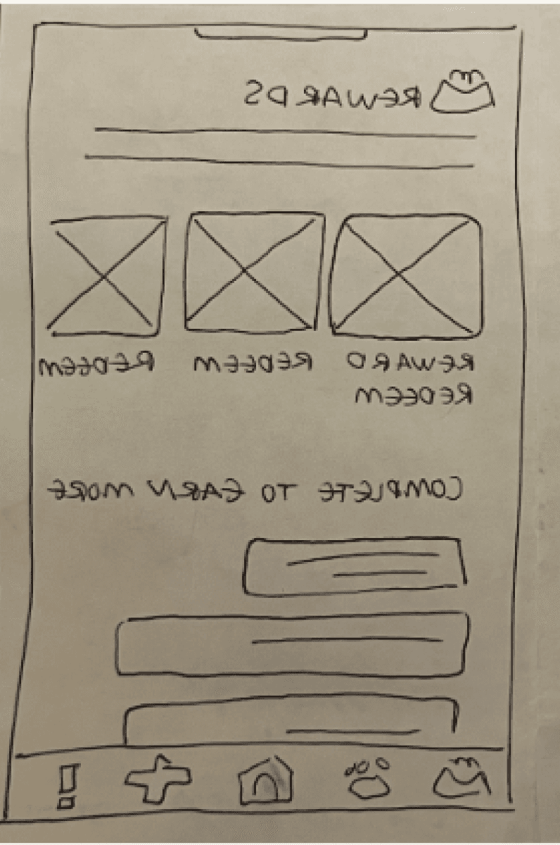
For example, this screen was not intuitive to a users what the rewards were and what it would mean to complete them or not
Iterated Designs
(Figma Prototype after Usability testing)
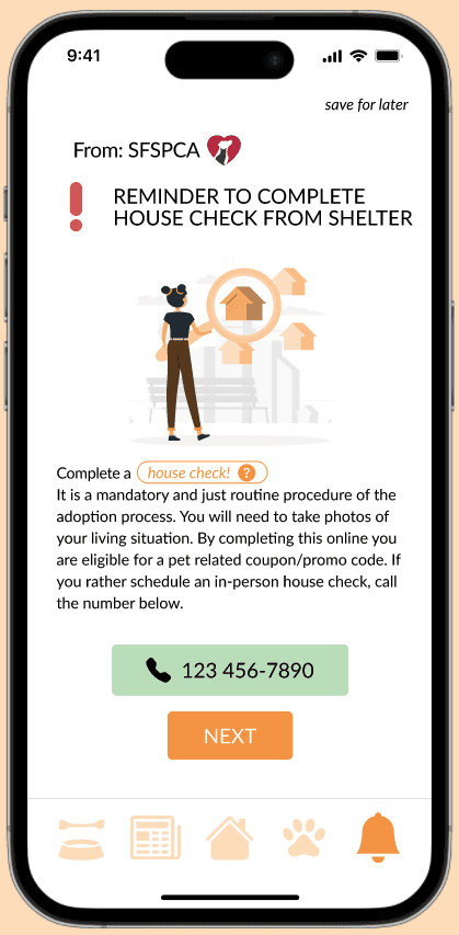
Based on the feedback we added a lot more text and intuitive icons (in the nav bar) to make the app and experience less confusing for the users. Our peers mentioned issues of privacy for the housecheck so we added an call-in in-person houecheck option if users didn’t want to take images of their house. We could not get rid of this task, because certain shelters require adopters to go through this process to prove that they are properly taking care of their pet.
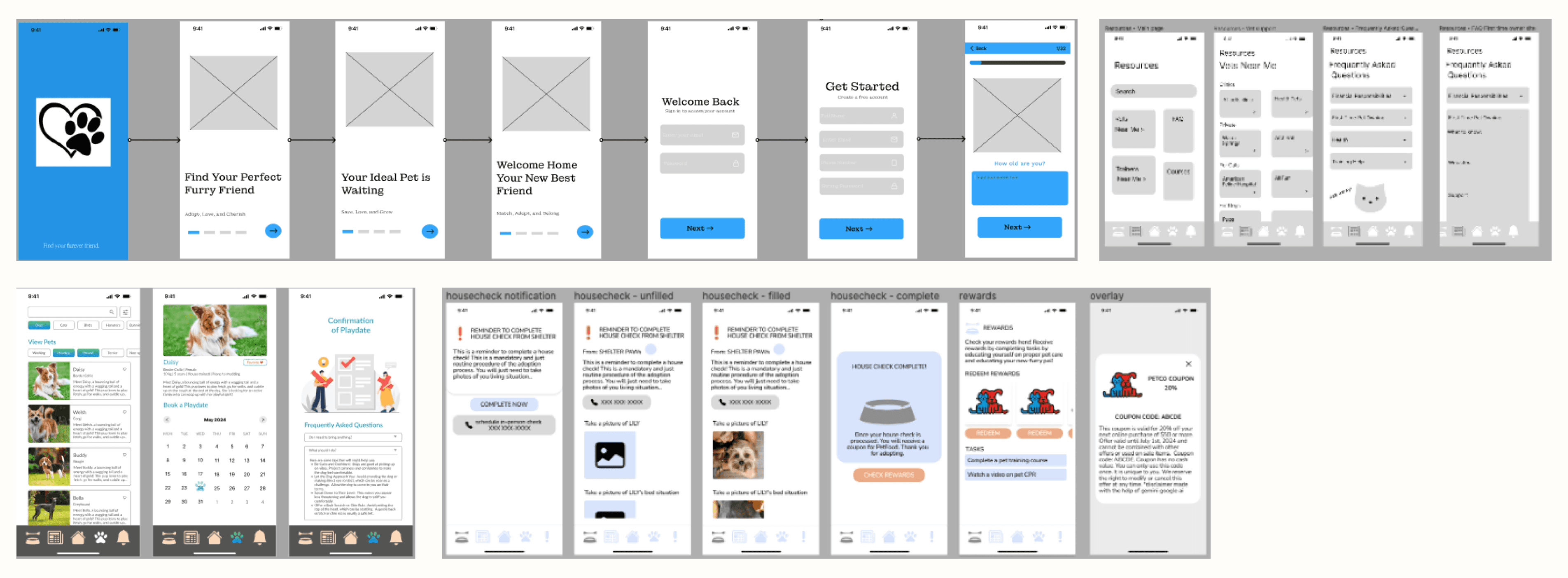
Figma designs and prototyping
Changes for the Final
In addition to more intuitive changes, such as buttons, icons, and more text, we wanted to emphasize these features:
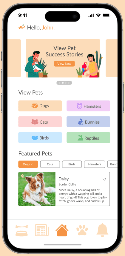
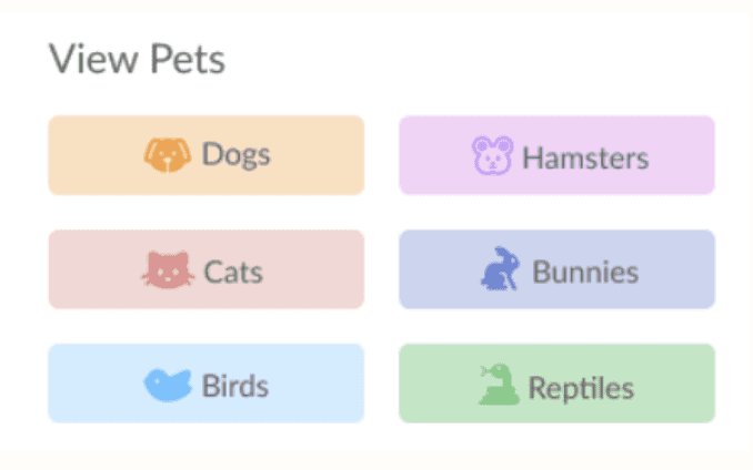
A functional and convenient dashboard. After signing up or logging in, we wanted to provide an easy access to all of the key features, while also making the app look more inviting.
A more intuitive search feed. With all the additional task features, we had less focus on the actual feed to search for a pet. We also tried to make it more accessible by including it into the dashboard.
Heuristic Evaluation Process
We then conducted heuristic evaluation process to gain a better understanding of possible usability issues according to a set principle. The principle that we used and based our evaluations off of was Nielsen Heuristics. For the heuristic evaluations, we chose a variety of different heuristics to focus on for our four different tasks. The four tasks that we evaluated revolved around our four key feature: (1) scheduling a playdate, (2) completing the sign up questionnaire and navigating the homescreen, (3) completing a housecheck task, and (4) reviewing resources.
Tasks
The user is presented with the task of scheduling a "playdate" with the animal of their choice, in an attempt to get both parties to interact with one another, and see if they are a suitable match"
Users were given the task of completing the survey questions upon signing up/in. They were also given the task of navigating the home screen to learn about the app and its resources.
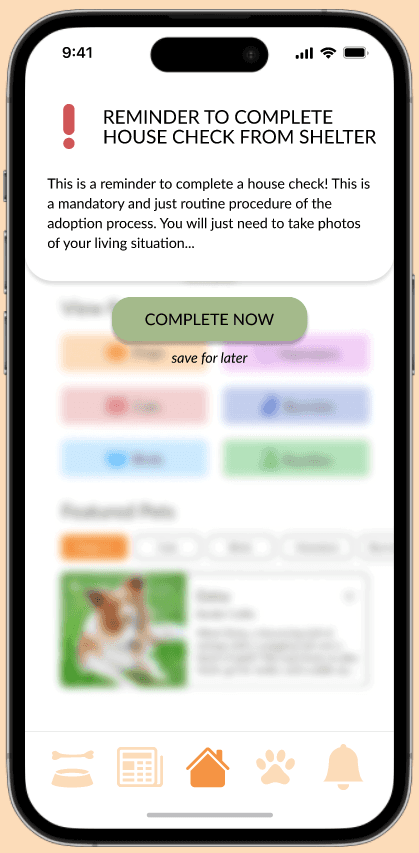
User is presented with housecheck notification couple days after adopting pet.
Users review resources that they can use either during their pet adoption process or while they are taking care of their pet.
From these tasks, as a team we listed the heuristics that the current designs violated or were able to do well in.
We addressed multiple heuristics across our four tasks. Below are just a couple detailed.
Format: Heuristics → explanation of heuristics > general changes that can be made to the designs
User Control & Freedom, → users should be allowed to make errors and recover > update forms to have a back button
Error Prevention, → preventing users errors > provide more details or detailing what’s required
Recognition over Recall, → Minimize the user's memory load > make information concise
Match Between System and Real World, → design should speak the users' language > should be understandable with the option to expand
Visibility of System Status, → users should be kept informed by the design > designs should be intuitive (resources being a newspaper and rewards page being a treat)
Help and documentation, → provide help for users > provide options to expand on uncommon vocabulary
Flexibility and efficiency of use, → create shortcuts > ensure that there are quick ways to get to common screens
Aesthetic and minimalist design → keep things simple > keep designs uncluttered
Heuristic Evaluation Summary
From the heuristic evaluations here were some of the concrete steps that we took to update our designs.
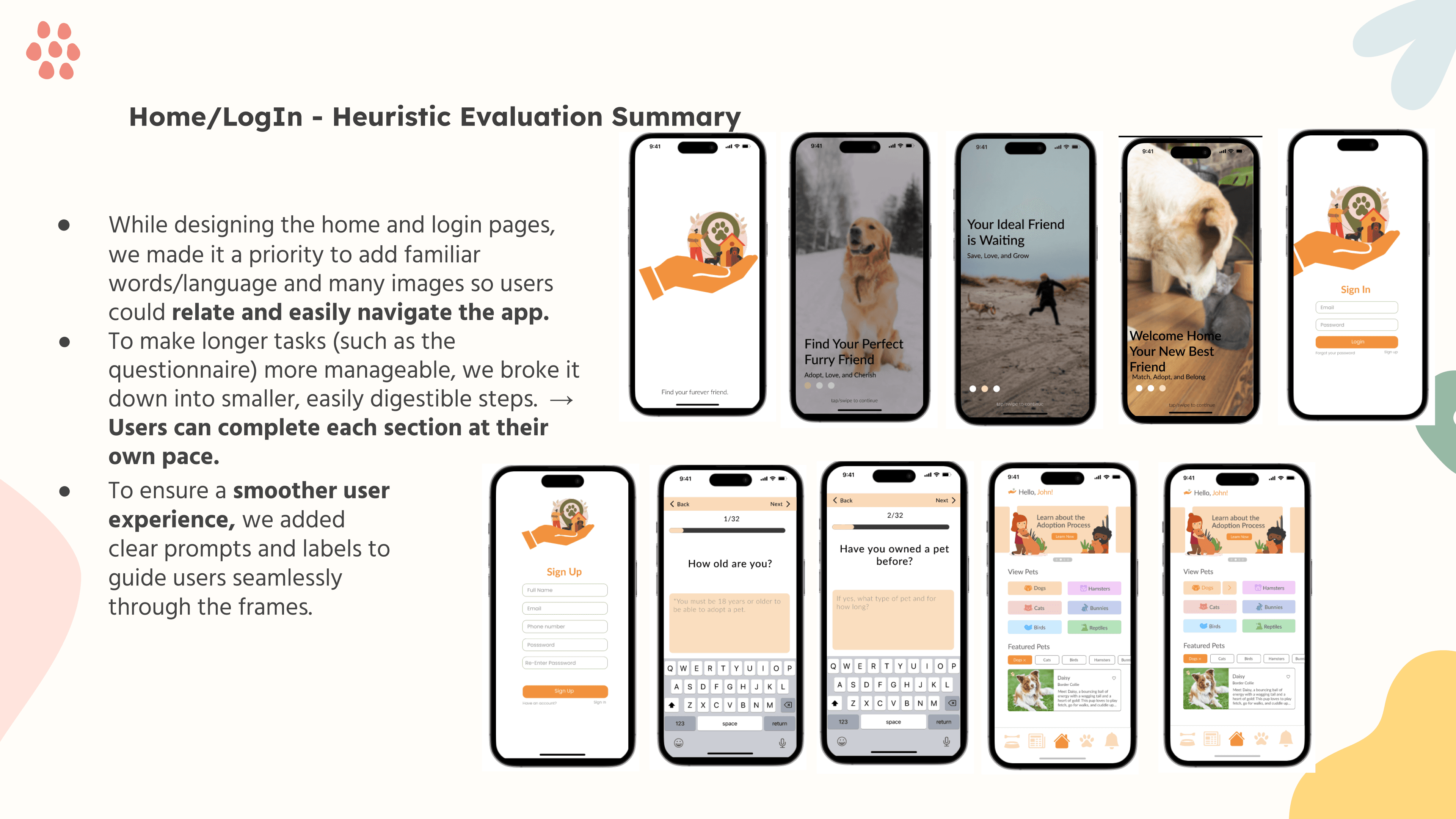
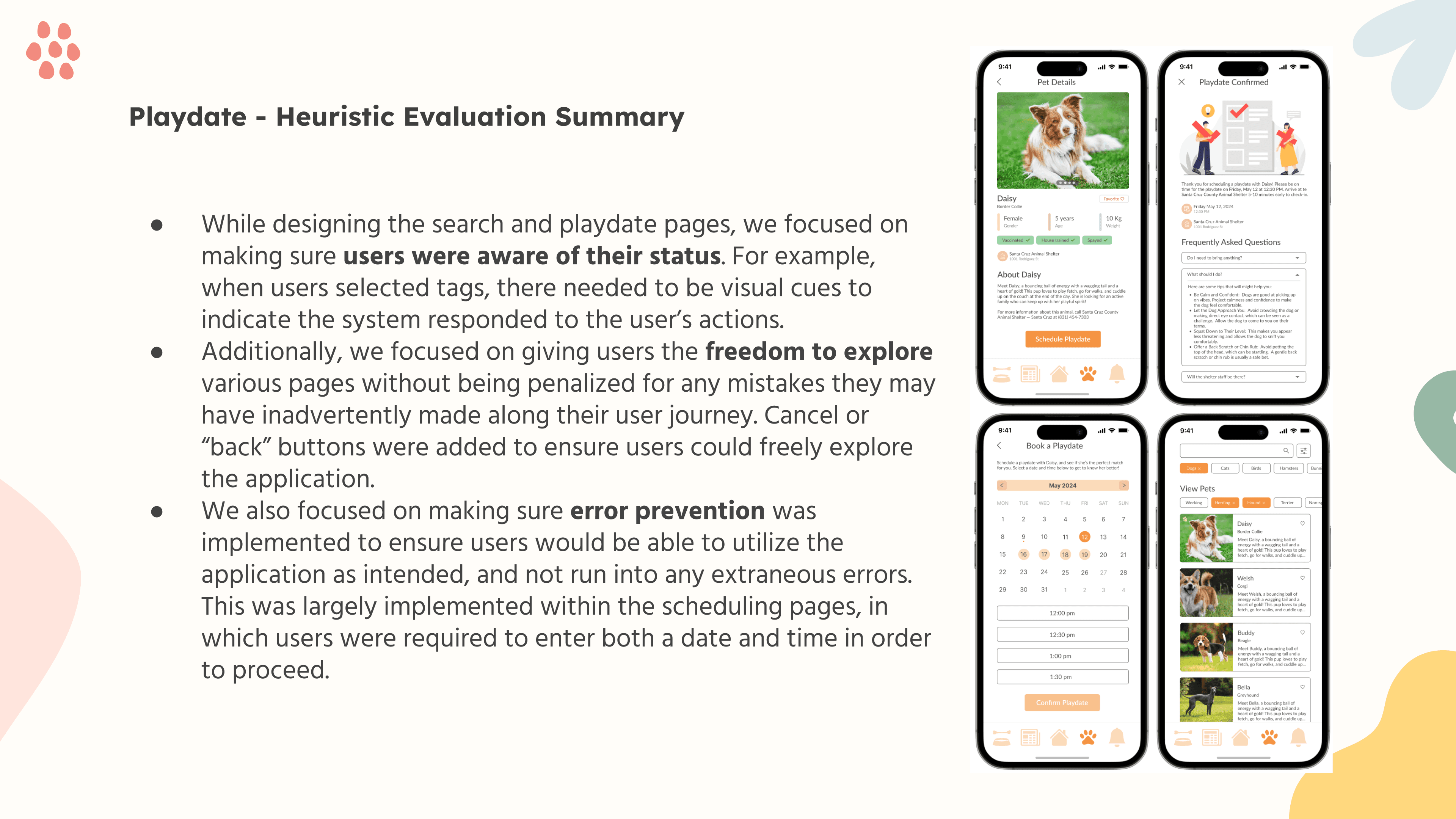
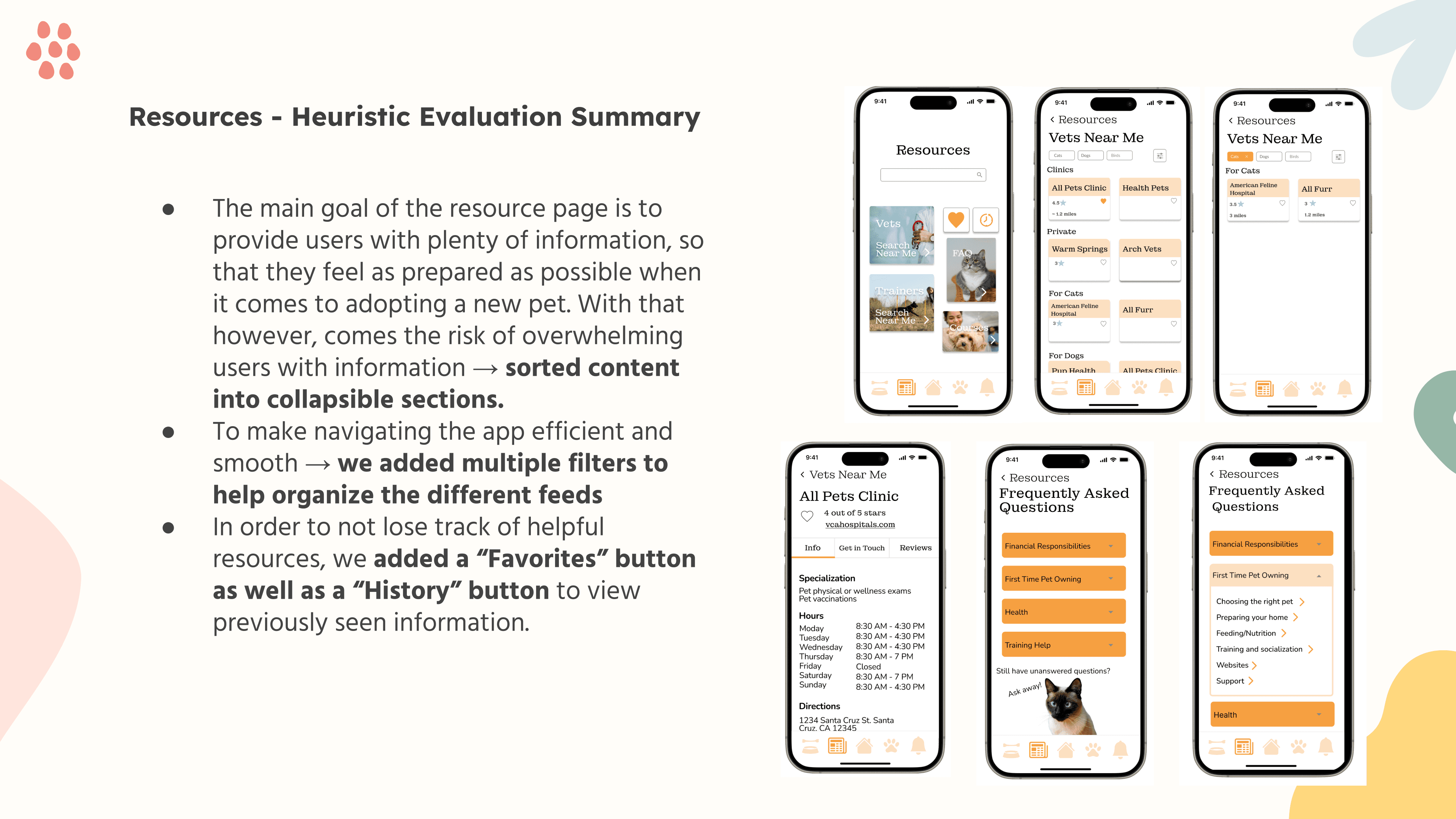
(the above slides were not written by me, but by my other team members)
Housecheck - Heuristic Evaluation Summary
Users really need a lot of information on what this task is because it is something mandatory during the adoption process (depending on the shelter), but those that are familiar with the adoption process don't need to look → added an extra info button
There is not enough information on what the rewards are and how users can interact with it → added more tasks and also added additional information on what the tasks are.
There is no way for users to leave a page and then go back. There was no “X” button or “save for later” button → added exit buttons
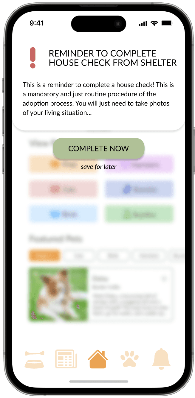
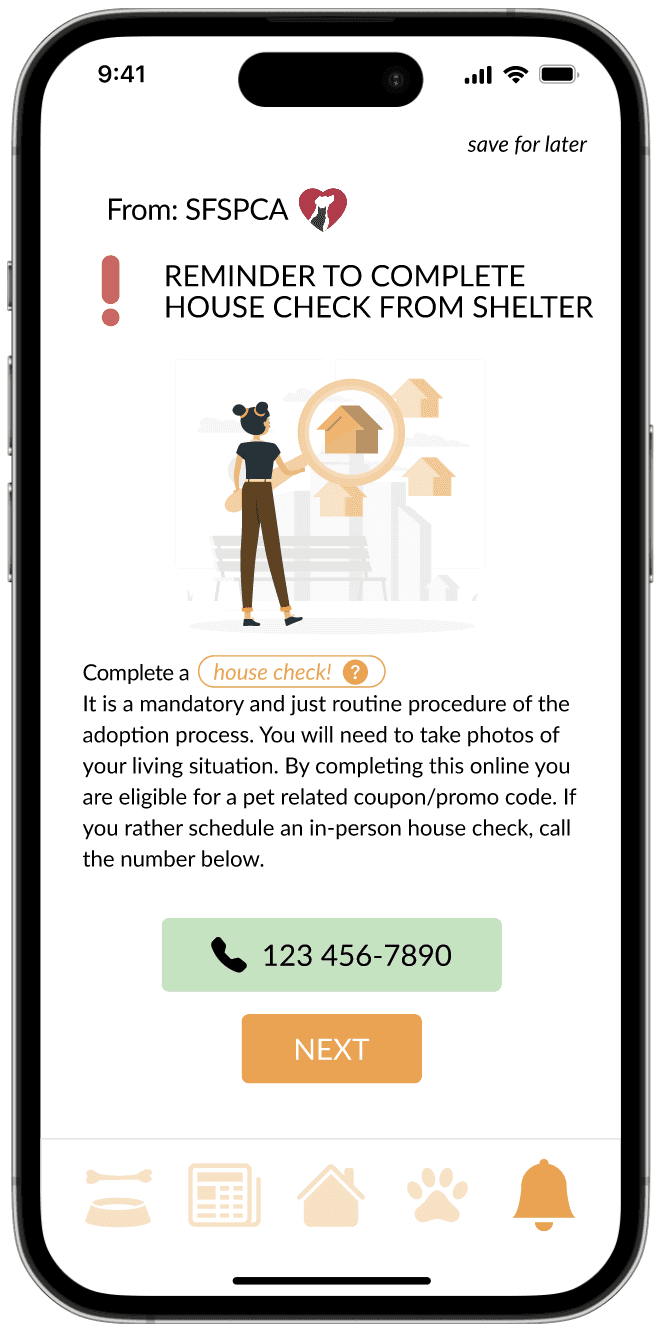
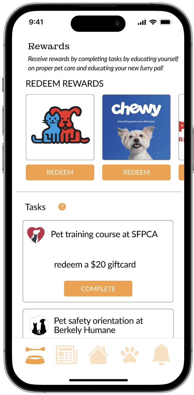
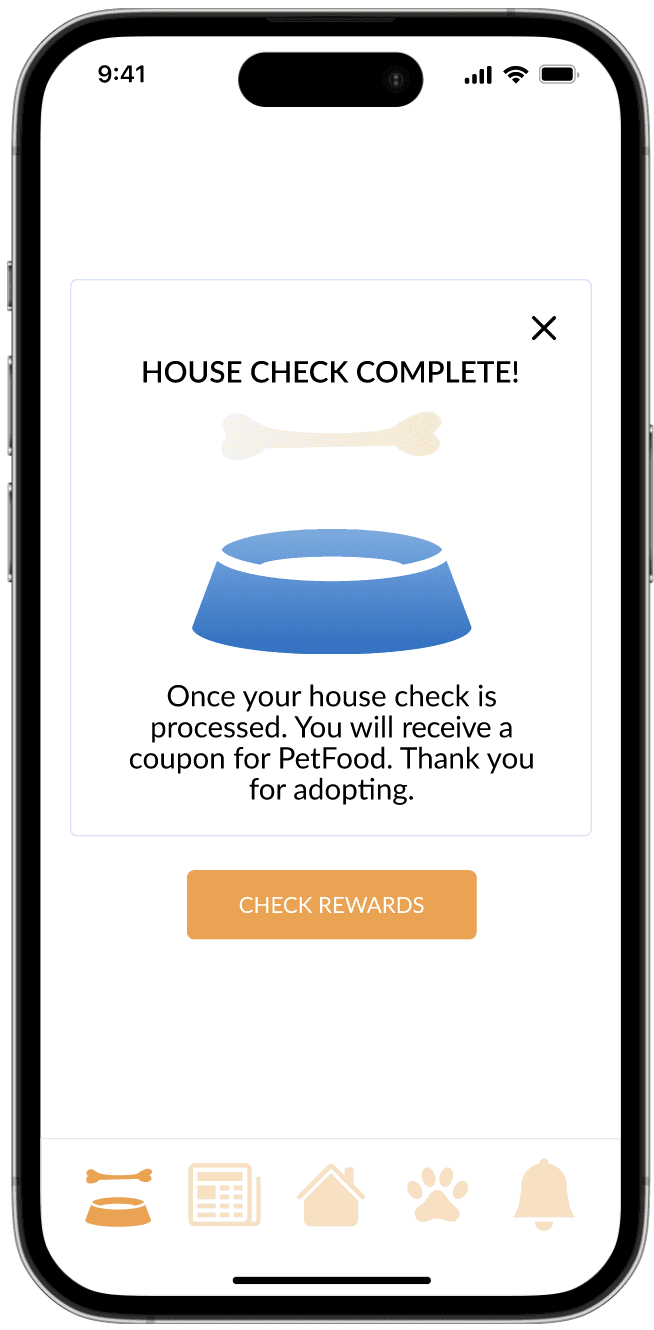

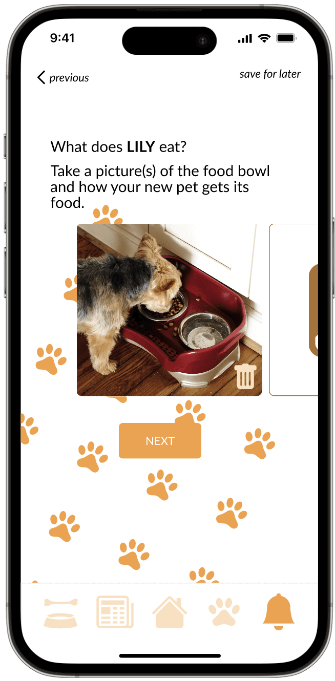
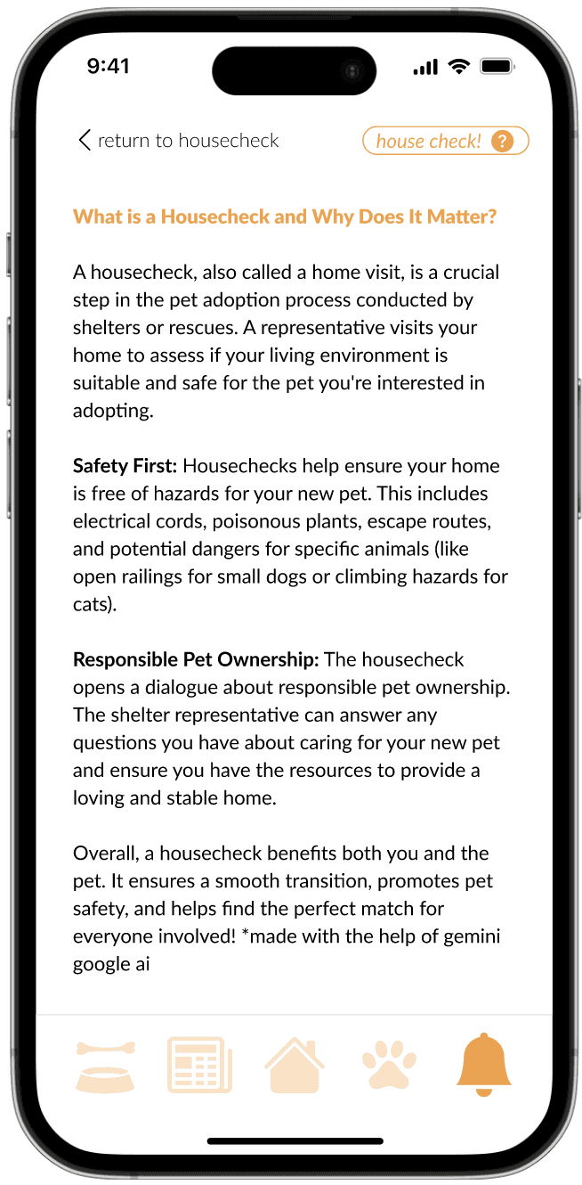
Final Figma Prototype (after Heuristic Evaluation)
Overall we had wanted to make the process as useful and informative as possible. We did not want users to be confused as many of them will be potential first time adopters so they would be needing a lot of help along the way. We added informational pieces of information along the way such as helping text in input boxes or by having intuitive icons and buttons. We separated information as digestible as possible.
Reflection
If I were to do this project again knowing what I know now:
better documentation
there was a lot of intentionality that came with designing the sign in page and the house check as they were based off of actual adoption procedures that I had found online. However, I can’t find the document anymore. I wish I had kept track of it
expanding on resources
I would have wanted to discuss with my teammates to discuss on the uses of the resources from already experienced pet parents to extend the longevity of the app. Currently the app seems good for new time owners which was the intention, but it would be nice to have researched/interviewed a bit more to learn more about what existing pet parents think about. We learned that they tend to only call their vet, which was included in our designs, but I would have liked to learn more.
Overall, I had an amazing time getting more in depth into the different user expereince tools that I can use in the future. I was able to work with a great team. I was in charge of the “hosecheck” and “rewards” feature and also did the majority of the final presentation (with the exceptions of the heuristic evaluations specific to their assigned features). It was a really interesting experience and I absolutely adore animals so I would love to have continued working on this project more.
thank you for looking
- iren w